3June 2011
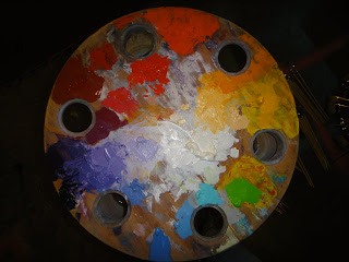
Recently I have become fascinated with the use of triadic harmonies of color. I tend to use them muted down and simplified with base colors remaining the same throughout the entire palette as I keep one color as a constant.
I enjoy how a triadic harmony used with their complements sets a tone of dissidence and equality within color-forms. The disagreement between the colors evens out and a balanced harmony appears to take the forefront.
In this palette you can see these colors…
cadmium yellow light
cadmium yellow medium
cadmium yellow deep
cadmium orange
cadmium red light
cadmium red deep
provence violet reddish
radiant violet
dioxazine violet
violet grey
radiant turquoise
kings blue deep
kings blue light
cadmium green light
and titanium white + zinc white as a toner
